
WorkSource app
A design of a WorkSource app aimed at helping low-income job-seekers get the public transit they need to access all the myriad career resources available at WorkSource.
My Role
I was in charge of visual design for this project, and had some project management responsibilities. I helped our researcher gather initial information to work with during the discovery phase of our project, and then worked on branding and creating high-fidelity mockups of our final design. Additionally, I coordinated and refined our group presentation.
RESOURCES AND TOOLS
Sketch, Invision, Google Drawings, Google Suite, Pen and Paper, Sessions College Color Calculator
SPRINT LENGTH
2 weeks
Background Information
Project Scope
For this unsolicited app design project, I looked to design an app that did social good that would be (theoretically) funded by a sponsor of my team’s choice. Alongside a team of three other designers, I chose to address the issue of (low-income) job-seekers that needed assistance with transportation services.
What is WorkSource?
A job-search agency with a large amount of resources and numerous offices in Washington that is officially partnered with Washington State’s Employment Security Department (esd.wa.gov).


![[P3] Style Guide.png](https://images.squarespace-cdn.com/content/v1/5bfb2e72af20967c04da97ff/1549938879386-IMWW875MMA30M4WGHUDU/%5BP3%5D+Style+Guide.png)
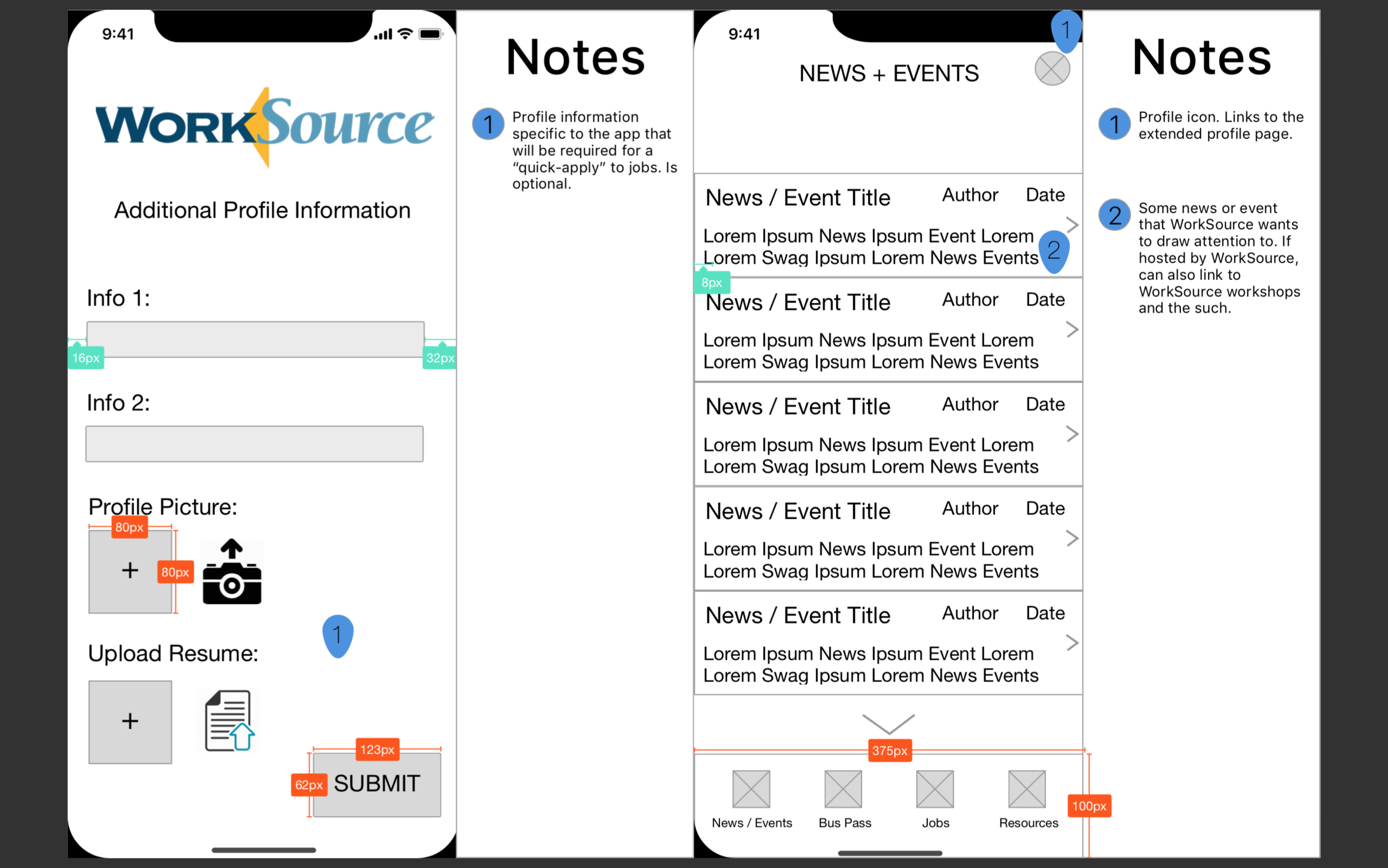

![[P3] Hi-Fi Event Feed.png](https://images.squarespace-cdn.com/content/v1/5bfb2e72af20967c04da97ff/1549939156265-KCBBUKRYJPZRNTN9SNJE/%5BP3%5D+Hi-Fi+Event+Feed.png)
![[P3] Hi-Fi Resources.png](https://images.squarespace-cdn.com/content/v1/5bfb2e72af20967c04da97ff/1549939155059-YGF2CPRSYBCM93CNWM6H/%5BP3%5D+Hi-Fi+Resources.png)
![[P3] Hi-Fi TransitPass.png](https://images.squarespace-cdn.com/content/v1/5bfb2e72af20967c04da97ff/1549939155995-MGPIGKBIGDYR2BUSY7Y0/%5BP3%5D+Hi-Fi+TransitPass.png)


